Creative process
A colour brief with a point of view
2 Min Read
Turn references into a clear palette without losing the unexpected.
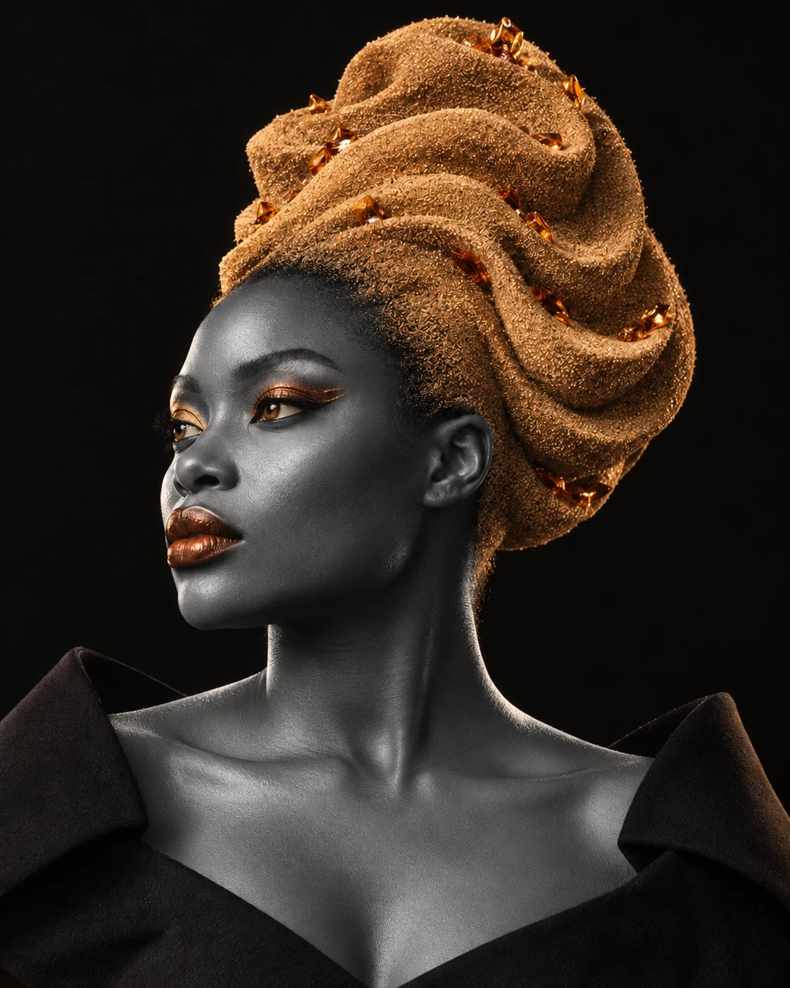
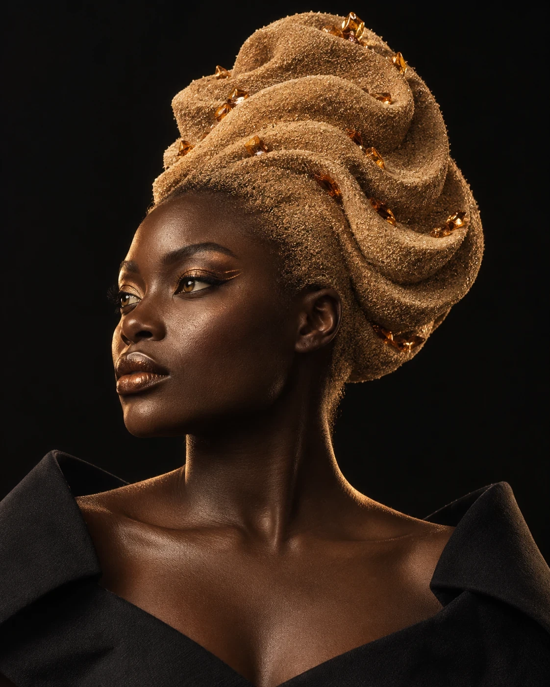
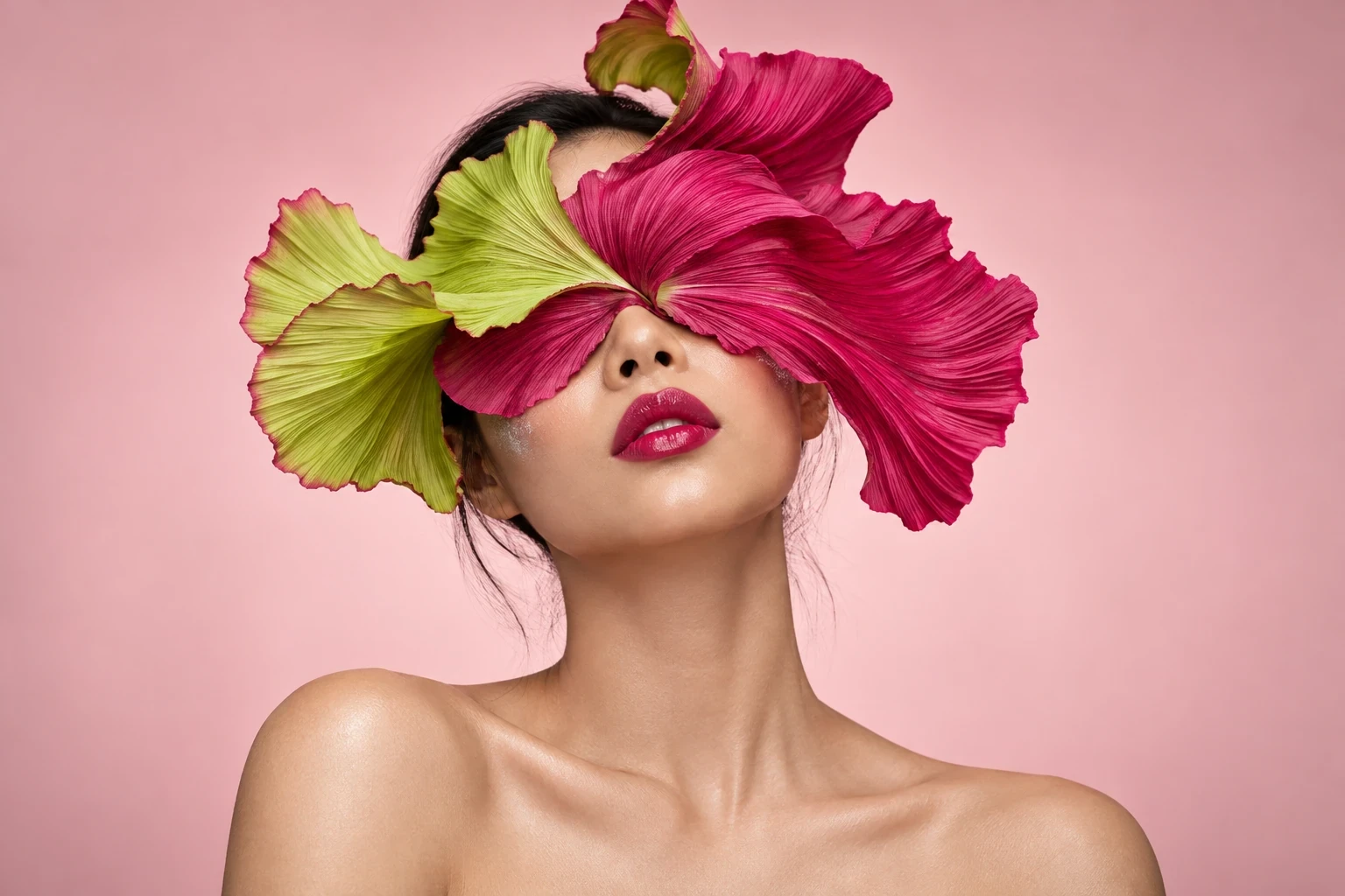
A useful colour brief describes a relationship. Is a cool eye meant to interrupt a warm portrait? Should the lip echo the clothes, or introduce an entirely different note? These decisions give an expressive look a reason to exist.
Give each reference a job
Choose a small group of images and name what matters in each: the placement of colour, the finish of the skin, the proportion of a shape or the mood of the light. A reference for texture does not have to dictate the whole palette. Separating those ideas makes the conversation clearer.
Leave room for a surprise
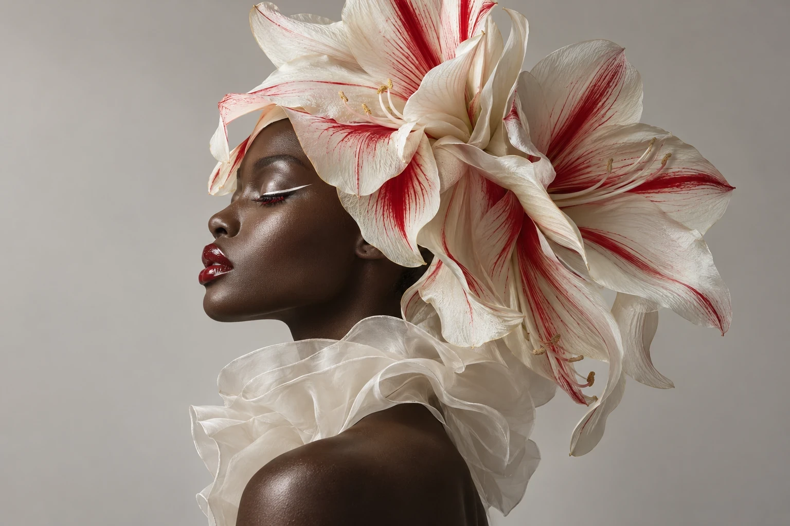
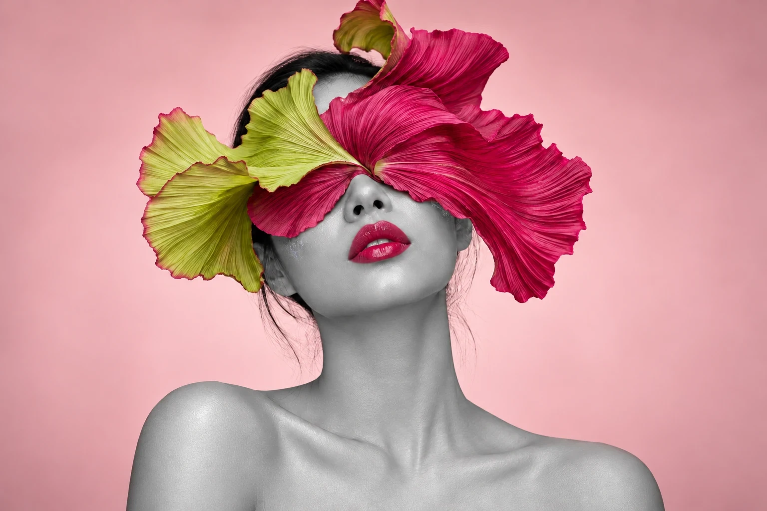
Build a main colour family, a contrasting accent and a quieter area where the eye can rest. The accent might be a thin line rather than a large block. Its scale matters as much as its hue. Sketch a few proportions before committing to the most obvious combination.
See the whole frame
Review makeup alongside hair, clothing and the background. A strong shade can disappear against a similar set, while a restrained detail can become striking in the right contrast. Agree what should lead the image, then let the supporting elements make that choice easier to see.

From the studio